DIY Share Day! This wreath or sign stand is made from a fence post and wooden corbels purchased at a local hardware store. The corbels make a sturdy stand for the heavy post. Add an iron hook and you have a great wreath stand for your front porch or entry. I chose to paint mine but you could also stain it to match any wood trim in your home. Right now I’m using mine to hang a “no soliciting” that sign I made. I’ll switch it out with seasonal wreaths and signs. 🙂 #cartiagehousestaginganddesign 
Category: Uncategorized
Mood Board Monday!
Who wouldn’t love a chic, feminine home office space? 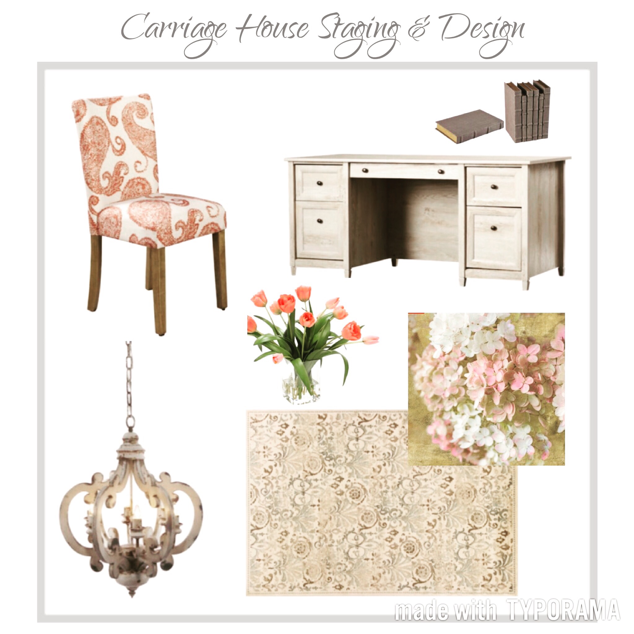
Sunday Shareday!
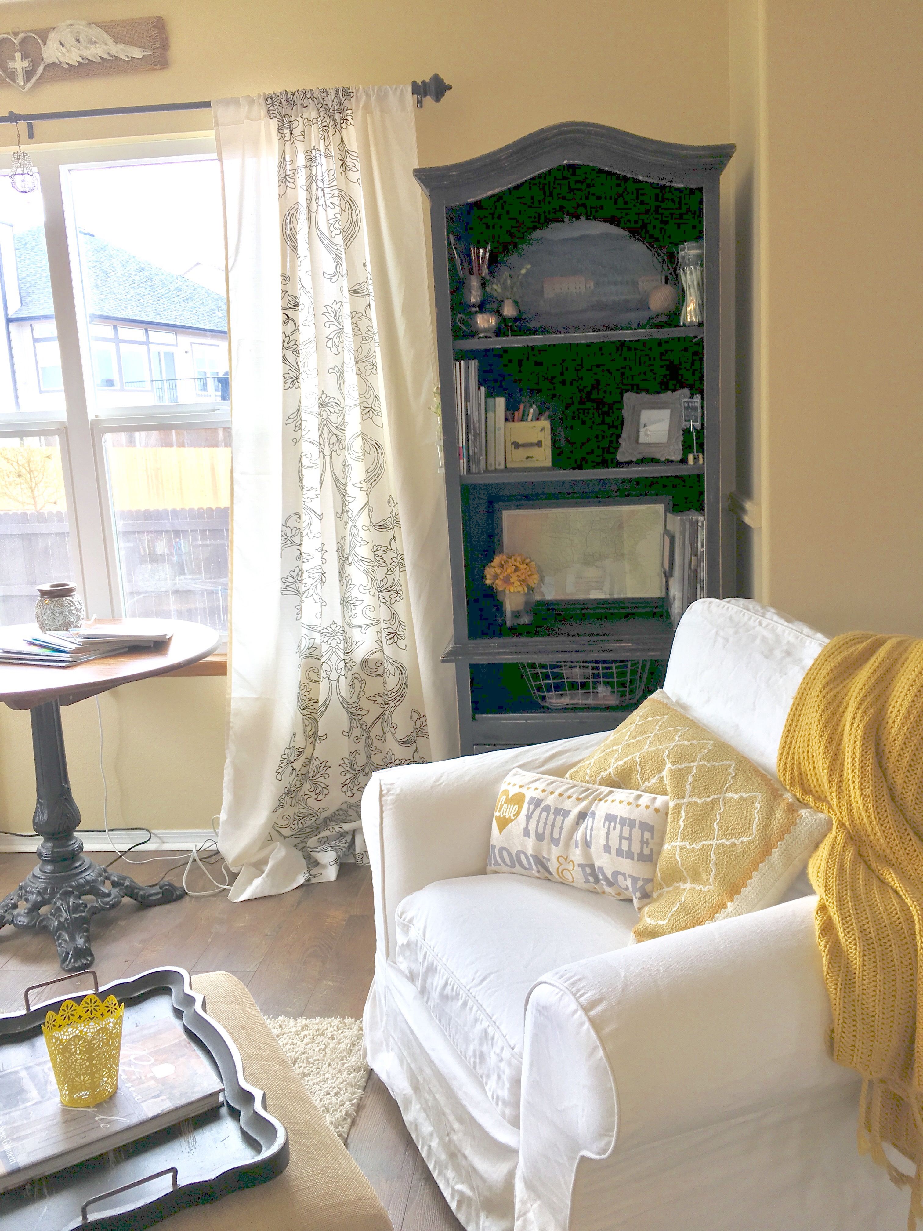
In inside view of my work area. I love the pop of yellow and the mellow feel of my office. It’s a comfortable place I like to spend time in. 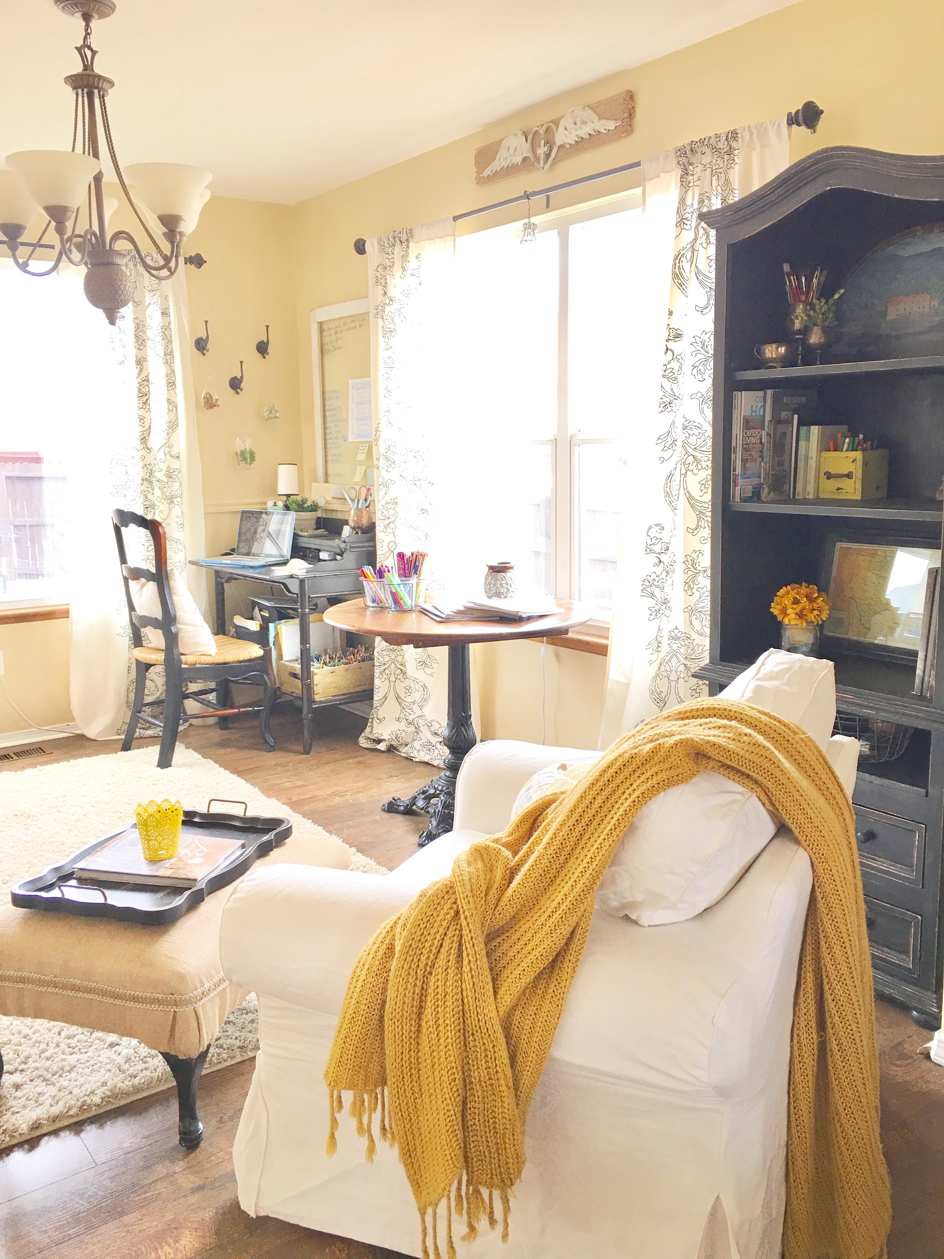
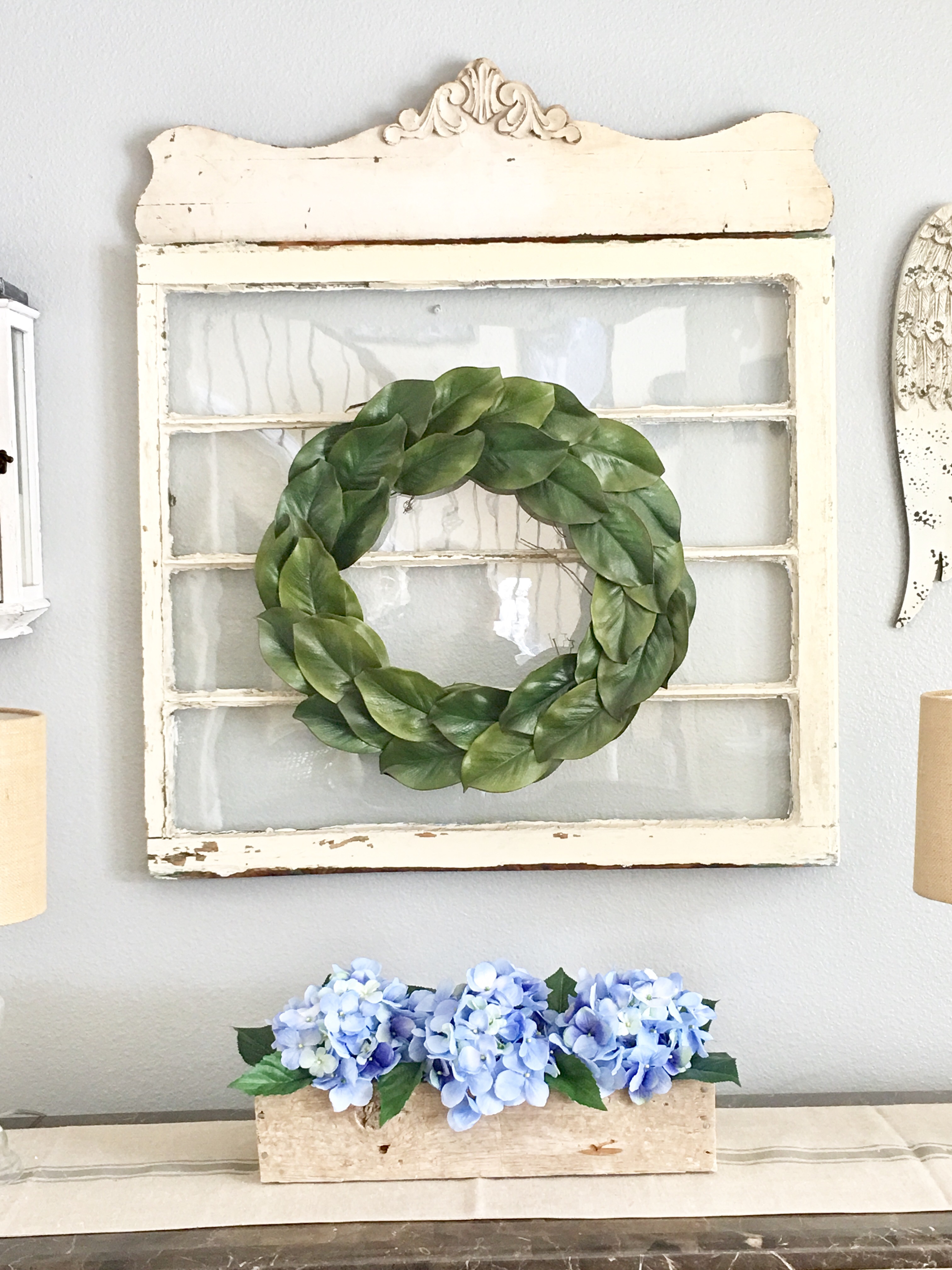
Spring = Hydrangeas!
Spring = Hydrangeas!! The “periwinkle” blue shade is my favorite! I used pallet boards to make the rustic box I used in this photo. #carriagehousestaginganddesign #floraldesign #palletprojects

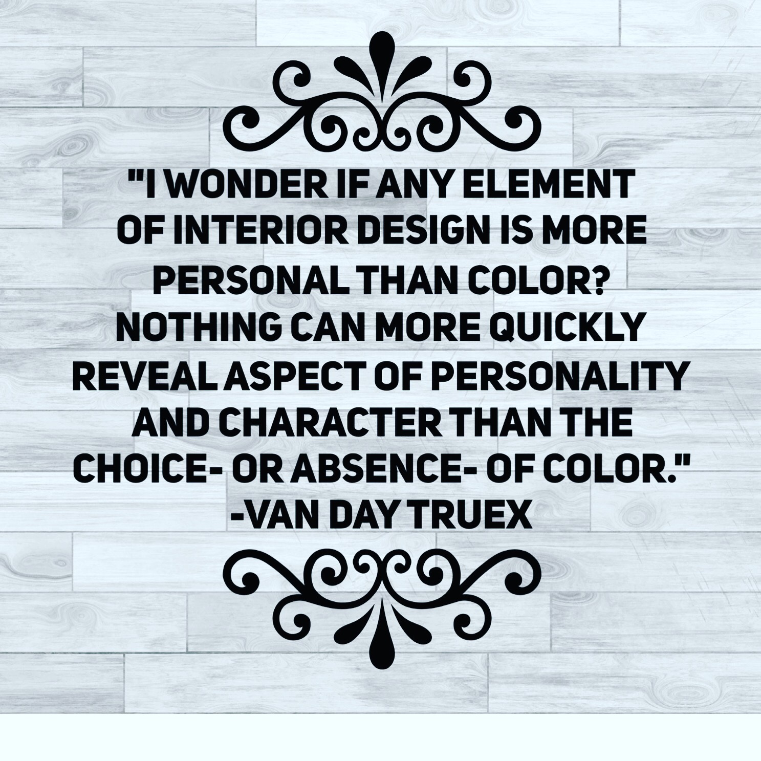

The Psychology of Color
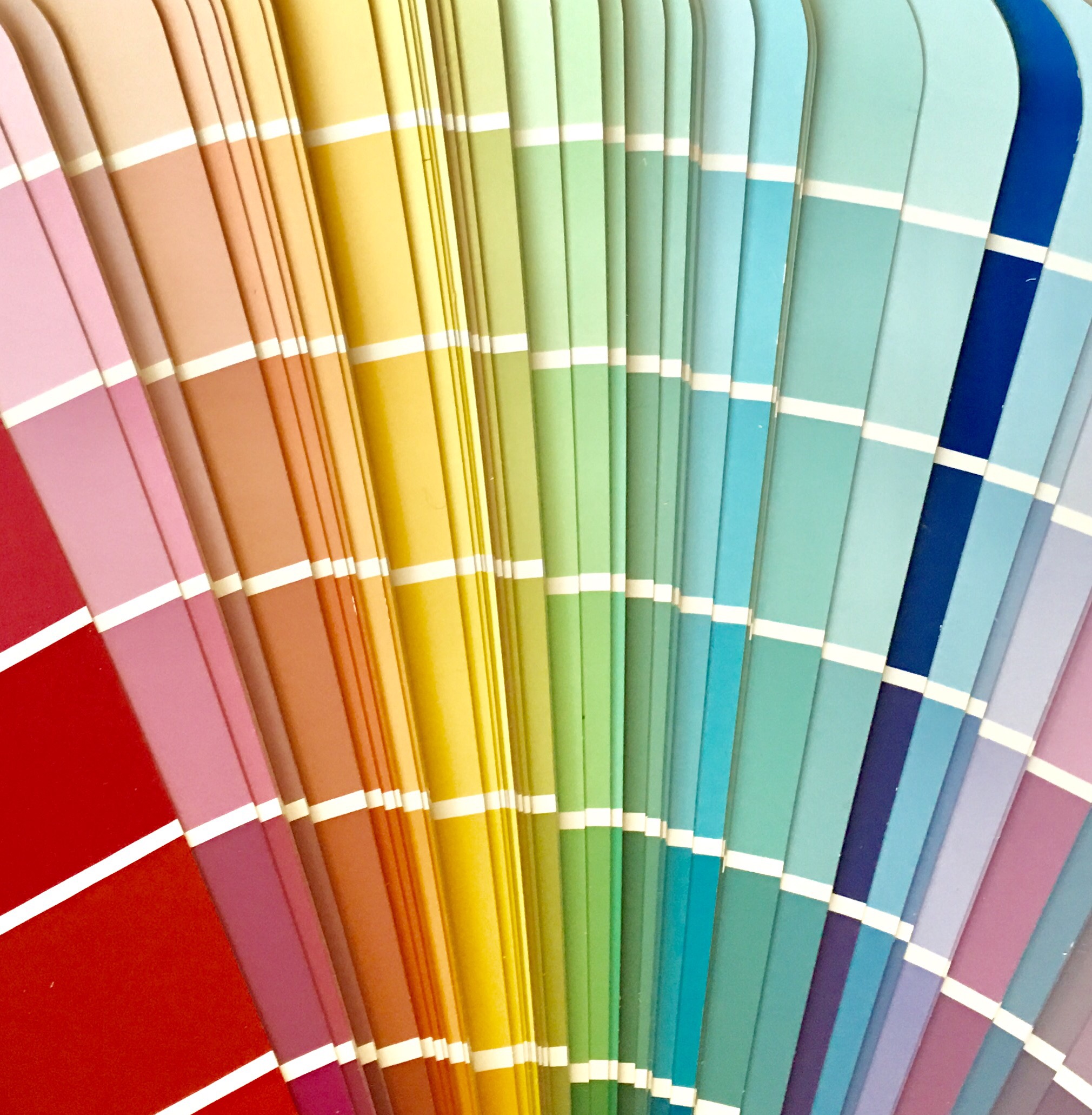 Color is a powerful communication tool. Light and color influence the way people feel and interpret a space, a room or an environment around them. Using the right color pallet in your home can evoke welcoming feelings and positive moods and emotional responses.
Some examples of common emotional responses to different colors are:
BLACK: fashionable, confidant, sophisticated, powerful, aggressive
WHITE: clean, serene, a blank slate, simplicity
RED: love, strength, passion, bold, sexy, angry, exciting, aggressive
BLUE: calm, peaceful, serene, stable, dependable, intellectual
GREEN: earthy, tranquil, harmonious, calming, restful, refreshing, soothing
YELLOW: cheerful, warm, friendly, energetic, positive, optimistic, inviting
PURPLE: luxury, royalty, sensual, exotic, lush, spiritual, creative
BROWN: earthy, comforting, lonely, dependable, serious, rugged
ORANGE: energetic, impatient, warm, vitality, enthusiastic, exciting
PINK: romantic, calming, feminine, tranquil
GREY: passive, neutrality, lack of energy, balance, calming
When selecting paint colors for your walls and shades for accent colors in your décor one should consider the effect color has on mood and individual responses. Think about the dynamics of your family and what kind of moods you want to create in your home. For instance, the color Red is thought to increase appetite and is often used in dining rooms and restaurants, whereas blue is thought to decrease appetite and is rarely used in either. Bedrooms are most often designed with serene pallets such as blues, lavenders, greens and neutrals. Bathrooms are best suited for shades that communicate cleanliness such as white, turquoise, blues and greys. For a family room or game room you might consider selecting accent colors that evoke warmth and energy such as oranges, reds and yellows. Blues are often used in living areas as where families enjoy relaxing because blues and greens create environments that feel harmonious and tranquil. But a room painted entirely blue may also feel cold and stark. Sometimes our favorite hues may be better utilized as accent colors and in moderation. The darker the shades of color the more intimate and sophisticated they feel. Lighter colors are more airy and make spaces feel larger. Color selection is personal and it is best to choose shades that are well suited for your lifestyle and your family member’s personalities.
The “Before” photo! :). We are about to start refinishing the cabinets in our kitchen. It’s come a long way already; custom island, new granite countertops, Blanca sink, new appliances, new tile flooring, new light fixtures and a new faucet and hardware. Now comes the transformation of the cabinets! I’m excited!! Wish me luck y’all! #kitchenrenovation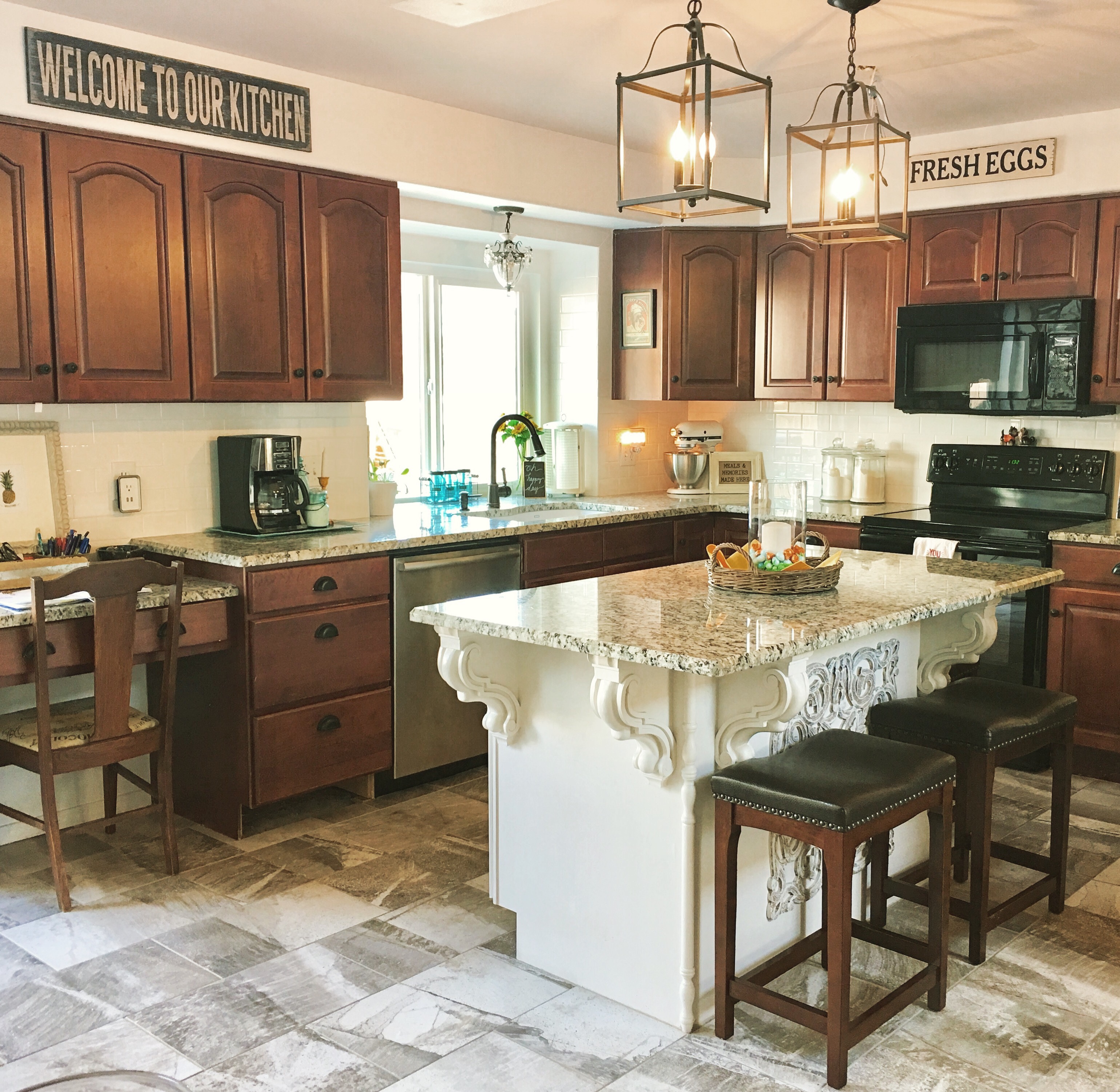
Grand Central Station at our house! We made this by using a plywood board, that we screwed onto the wall and painted it with magnetic chalkboard paint. Then we framed it with some decorative trim. Our kids love using the chalkboard and their magnetic letters. I added our family calendar to the top. 🙂 #carriagehousestaginganddesign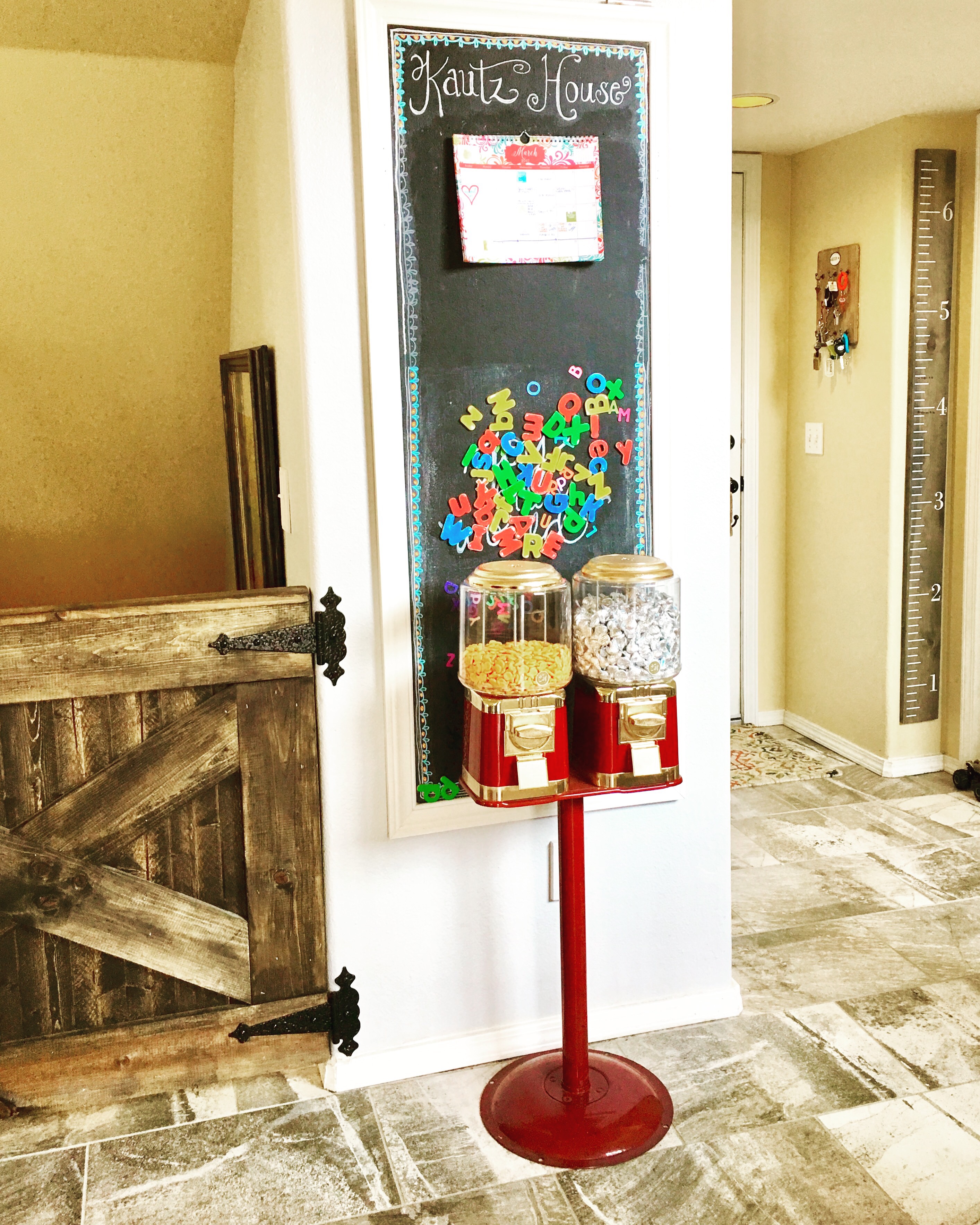
 New holders for marketing material. I set one of these on a table in homes I’ve staged.
