The Psychology of Color
 Color is a powerful communication tool. Light and color influence the way people feel and interpret a space, a room or an environment around them. Using the right color pallet in your home can evoke welcoming feelings and positive moods and emotional responses.
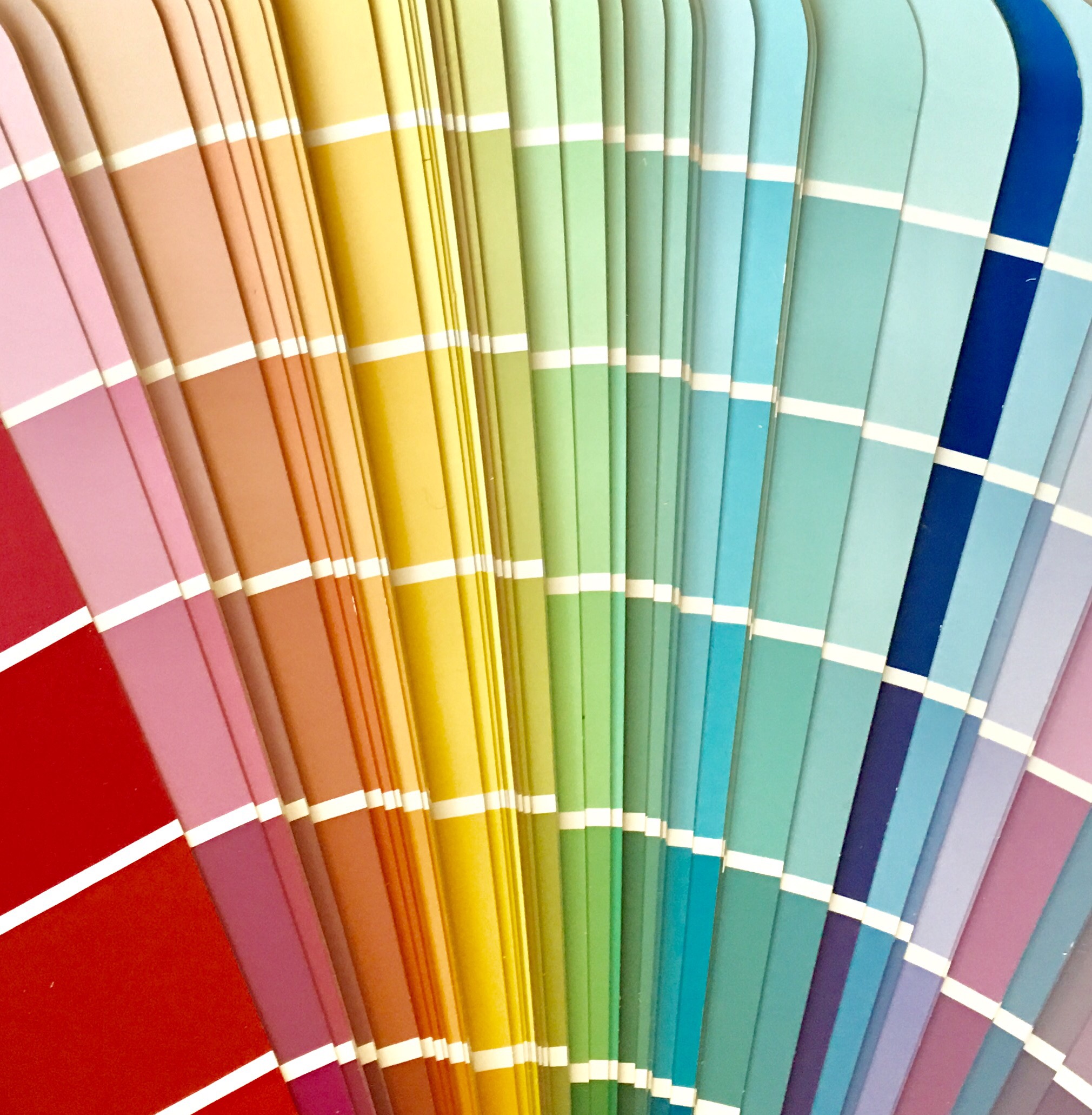
Some examples of common emotional responses to different colors are:
BLACK: fashionable, confidant, sophisticated, powerful, aggressive
WHITE: clean, serene, a blank slate, simplicity
RED: love, strength, passion, bold, sexy, angry, exciting, aggressive
BLUE: calm, peaceful, serene, stable, dependable, intellectual
GREEN: earthy, tranquil, harmonious, calming, restful, refreshing, soothing
YELLOW: cheerful, warm, friendly, energetic, positive, optimistic, inviting
PURPLE: luxury, royalty, sensual, exotic, lush, spiritual, creative
BROWN: earthy, comforting, lonely, dependable, serious, rugged
ORANGE: energetic, impatient, warm, vitality, enthusiastic, exciting
PINK: romantic, calming, feminine, tranquil
GREY: passive, neutrality, lack of energy, balance, calming
When selecting paint colors for your walls and shades for accent colors in your décor one should consider the effect color has on mood and individual responses. Think about the dynamics of your family and what kind of moods you want to create in your home. For instance, the color Red is thought to increase appetite and is often used in dining rooms and restaurants, whereas blue is thought to decrease appetite and is rarely used in either. Bedrooms are most often designed with serene pallets such as blues, lavenders, greens and neutrals. Bathrooms are best suited for shades that communicate cleanliness such as white, turquoise, blues and greys. For a family room or game room you might consider selecting accent colors that evoke warmth and energy such as oranges, reds and yellows. Blues are often used in living areas as where families enjoy relaxing because blues and greens create environments that feel harmonious and tranquil. But a room painted entirely blue may also feel cold and stark. Sometimes our favorite hues may be better utilized as accent colors and in moderation. The darker the shades of color the more intimate and sophisticated they feel. Lighter colors are more airy and make spaces feel larger. Color selection is personal and it is best to choose shades that are well suited for your lifestyle and your family member’s personalities.
